Using this “theme” is not difficult, but you need to know a few basics, so your design can make its best impression. It is depending on two things, namely using a theme and make extensive use of the template function from the custom_componentbutton-card made by RomRaider. The design system consists of graphical buttons, that are changed depending on their use.
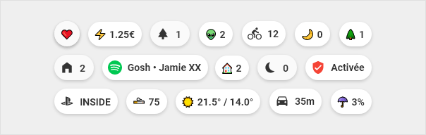
At the top of each page we find the chips, which allow to quickly visualize important information.
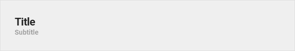
Title
Titles are used to separate the different sections. Kind of a divider…
Vertical buttons
For using the cards as a button.
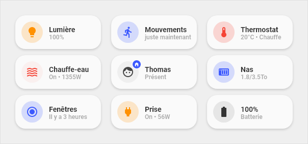
Cards
Cards are the main part of this design and are widely used in very different designs and functions. With these cards you can set up nearly every entity in HA, showing from “state-only” over a “full blown” information graphic with various values to “controlling” your covers and climate entities.
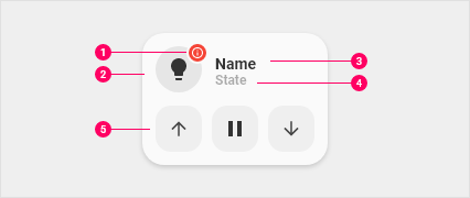
Anatomy of cards
Dot: Visible when the device is unavailable. Also used on the entity person
Icon: Icon that represents the device
Primary line: Main information
Secondary line: Secondary information
Optional part: Possibility to display buttons to launch actions related to the device. Or display a graph to view the history of a sensor or you let your fantasy take the ride…
In the list above #5 enhances the normal cards with a “second line”, that is used to display other information like a graph or the controls for your covers. For this readme the cards are divided into three groups:
1-line cards: These are cards for sensor or binary_sensors like light or power outlets.
2-line cards: These are cards with a second line for informations or controls, eg. your cover controls.
Custom cards: These are special cards, that you can install, only if needed. These cards are mostly developed and contributed to the repository. Eg. an aircondition-card that shows the state of your aircondition and buttons to control it.
Changing templates
There are cases, actually a lot of them, where you want to change or extend existing template code. Doing this inside the code from the repository isn’t a good idea, as the next update would overwrite your changes. But don’t worry, we have taken care of that and you can very easily extend our code with your own.
The `binary-sensor-card` is to show the state (on/off, open/close, etc.) of a binary sensor, eg. your garage door or a window contact sensor. This card shows an alert if the state is on/open or unavailable.
This is the `generic-card` to display values from a sensor, eg. to show humidity, your next waste collection date or whatever sensor value is provided.
The `card_graph` shows an entity with the actual state and a *min-graph-card* integrated. This can be used for a thermostat to show the actual temperature and the history."
This is the `light-card`, used to toggle a light or a light group. Shows state of the light and, if available, brightness in %. In the picture on the right in row Nr1
The `light-slider-card` controls a light with the added possibilty to control the brightness of your light with a slider. See row Nr2 in the picture on the right.
The `light-slider-card (collapse)` is an enhanced version of the `light-slider-card`, that only shows the slider, if the light is on. In the picture on the right, the 'off'-state is like row Nr1, the 'on'-state like row Nr2
The `light-slider-card (horizontal)` is an enhanced version of the `light-slider-card`, that shows the slider on the right of the button, making it a 1-line-card. See the picture on the right row Nr3
The `card_media_player` shows you the *app*, the *title* and the *album name* playing, if the data is available through HA. The *app* is shown via a different icon.
This `chip` is to display a weather icon together with the outside and inside temperature.
Tap actions
One of the great features of button-card is, that you can set an action. These actions can be set on every card you configure, despite the cards that already have buttons. You have three possibilities to choose from:
tap_action
hold_action
double_tap_action
Each of these “events” can be configured to use a specific action. These actions are:
more-info
xxx_action:
  action: more-info # to show the more-info popup
  entity: your_entity # show more-info popup for this entity
toggle
xxx_action:
  action: toggle # toggles the entity of the card
call-service
xxx_action:
  action: call-service # to call a service from HA
  service: service.service_arg  # the service
  service_data: # additional data, eg. an entity_id
none
xxx_action:
  action: none # explicitly set to do nothing
navigate (HA internal)
xxx_action:
  action: navigate
  navigation_path: /ui-lovelace/home # the path to navigate to
For the chips, this “theme” uses the standard unicode emojis. The main reason is, they are multi-color whereas the mdi-icons that HomeAssistant uses are one color only.
These emojis are only used on the chips, all other cards or buttons use the standard mdi-icons!
Select the emoji you want and copy it (“CTRL + C” or right-click “copy” / at emojipedia.org you already find a “copy” button)
Go to your view and paste the icon
There are a lot of emojis on these pages, so we suggest you use the built-in search at emojipedia or the browser integrated search by pressing “CTRL + F” and type in your query like “heart”.