This is the in-depth list of our “usage” templates.
Note:Depending on the card you use, there are different things to set. Sometimes the entity is needed, sometimes the entity needs to be set as a variable, eg. ulm_card_xy_entity. In the template list is explained what you have to set.
Legend: variable | entry (eg. entity)
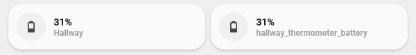
Battery Card
The `battery-card` is a slightly enhanced `generic-card`, just to ease the use. You could always configure it from the `generic-card` yourself.
"View" code
You're working in yaml-mode(Remember to take care of indentation)
If your entity provides the battery percent in an attribute (= not as an own sensor), fill in the attributes name here. Eg. if you have `sensor.livingroom_thermometer` and the attribute for your battery power is `sensor.livingroom_thermometer.attributes.battery_percent`, you fill in battery_percent here.
Binary Sensor Card
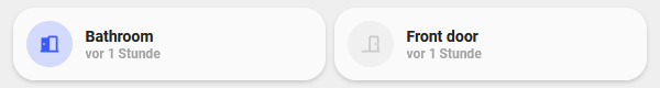
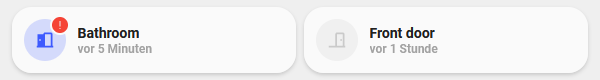
The `binary-sensor-card` is to show the state (on/off, open/close, etc.) of a binary sensor, eg. your garage door or a window contact sensor.
"View" code
You're working in yaml-mode(Remember to take care of indentation)
The `binary-sensor-card` is to show the state (on/off, open/close, etc.) of a binary sensor, eg. your garage door or a window contact sensor. This card shows an alert if the state is on/open or unavailable.
"View" code
You're working in yaml-mode(Remember to take care of indentation)
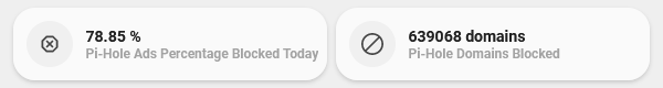
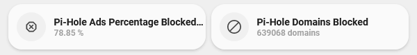
This is the `generic-card` to display values from a sensor, eg. to show humidity, your next waste collection date or whatever sensor value is provided.
"View" code
You're working in yaml-mode(Remember to take care of indentation)
The `card_graph` shows an entity with the actual state and a *min-graph-card* integrated. This can be used for a thermostat to show the actual temperature and the history."
"View" code
You're working in yaml-mode(Remember to take care of indentation)
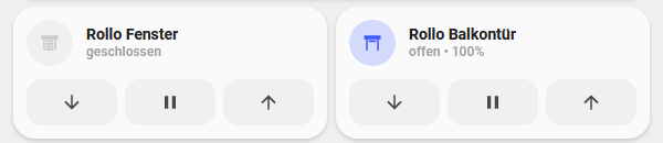
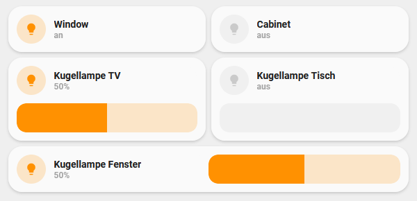
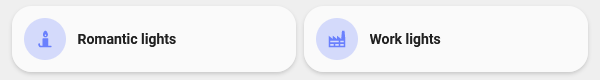
This is the `light-card`, used to toggle a light or a light group. Shows state of the light and, if available, brightness in %. In the picture on the right in row Nr1
"View" code
You're working in yaml-mode(Remember to take care of indentation)
The `light-slider-card` controls a light with the added possibilty to control the brightness of your light with a slider. See row Nr2 in the picture on the right.
"View" code
You're working in yaml-mode(Remember to take care of indentation)
If you want to set a specific name, eg. because your friendly name is too long for the card, this is the place to fill it in. If this is not set, the friendly name will be used.
Light Slider Card (collapse)
The `light-slider-card (collapse)` is an enhanced version of the `light-slider-card`, that only shows the slider, if the light is on. In the picture on the right, the 'off'-state is like row Nr1, the 'on'-state like row Nr2
"View" code
You're working in yaml-mode(Remember to take care of indentation)
If you want to set a specific name, eg. because your friendly name is too long for the card, this is the place to fill it in. If this is not set, the friendly name will be used.
Light Slider Card (horizontal)
The `light-slider-card (horizontal)` is an enhanced version of the `light-slider-card`, that shows the slider on the right of the button, making it a 1-line-card. See the picture on the right row Nr3
"View" code
You're working in yaml-mode(Remember to take care of indentation)
If you want to set a specific name, eg. because your friendly name is too long for the card, this is the place to fill it in. If this is not set, the friendly name will be used.
Media Player Card
The `card_media_player` shows you the *app*, the *title* and the *album name* playing, if the data is available through HA. The *app* is shown via a different icon.
Additional information
Currently there are only icons for:
Spotify
GooglePodcast
Plex
Soundcloud
YoutubeMusic
Unfortunately AmazonMusic, AppleMusic and Deezer don't have an `mdi:icon`, so the default icon (a speaker) will be presented.
"View" code
You're working in yaml-mode(Remember to take care of indentation)
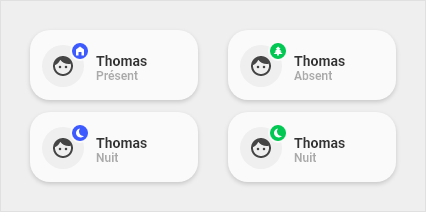
The `card_person` shows if a person is `home` or `not_home`. If you have setup other zones, it will show these as well.
Additional information
Dot color: at home - blue | away - green Dot icon: at home - Home icon | not home - Home minus icon | if you configured an icon for a zone, it will be used
"View" code
You're working in yaml-mode(Remember to take care of indentation)
- type: 'custom:button-card'
  template: card_person
  variables:
    ulm_card_person_entity: person.username
    ulm_card_person_use_entity_picture: true
    ulm_card_person_zone1: work
    ulm_card_person_zone2: school
You're working in UI-mode
type: 'custom:button-card'
template: card_person
variables:
  ulm_card_person_entity: person.username
  ulm_card_person_use_entity_picture: true
  ulm_card_person_zone1: work
  ulm_card_person_zone2: school
Variables / Entries
Variable / Entry
Example
Required
ulm_card_person_entity
person.username
true
The person entity
ulm_card_person_use_entity_picture
true or false
false
If you set this to true, the card shows the entity picture from your user, otherwise (set to false) shows the icon. Default is false.
ulm_card_person_zone1
work
false
Set another zone (beside "home") to use for the card. You can set up two zones besides "home".
ulm_card_person_zone2
school
false
Set another zone (beside "home") to use for the card. You can set up two zones besides "home".
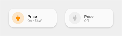
Power Outlet Card
This is the `power-outlet-card`. It shows you the state of a power outlet, and if configured, the actual power consumption of the power outlet.
"View" code
You're working in yaml-mode(Remember to take care of indentation)
This is your consumed energy. This is the sensor, that shows how many *kWh*s are consumed.
ulm_chip_electric_price
sensor.my_electric_power_price
true
This is the price for your consumed energy, if you have such a sensor. This should be a sensor that shows a price in your defined currency. If this variable is not set, the chip shows only the *kWh*s! If this variable is set the chip shows the price for the consumed energy!
Chip Presence Detection (counter)
This `chip` shows you the actual presence in your home. Shows residents and guests (guests only if one or more).
"View" code
You're working in yaml-mode(Remember to take care of indentation)
This is the sensor that provides your outside temperature. If you want to use eg. a temperature value from your weather provider, you'd need to setup a template sensor first. The state of this sensor should represent a numeric value (°C or °F doesn't matter).
ulm_chip_temperature_inside
sensor.my_temperature_sensor_inside
true
This is the sensor that provides your inside temperature. The state of this sensor should represent a numeric value (°C or °F doesn't matter).